


- Blog
- How learning Bursts Support Attention and Memory
Applying Microlearning to Longform Content
-
 Isaac Stewart
-
 February 25, 2016
Microlearning is a way of thinking about training that has revolutionized the way we build learning solutions. However, we still build a lot of elearning that is sourced by a huge block of content. What happens when you get a very large batch of content that needs to be turned into a learning solution? How can you apply microlearning principles to the content?
The University Content Challenge
When you consider a master’s program (or if you have completed one yourself), microlearning is probably the furthest thing from your mind. Long-form lectures, massive assignments and, in most cases, a thesis are potentially among the most difficult forms of learning to redesign into a form that feels like a brief, meaningful learning experience.
In early 2015, I got the opportunity to spearhead content management and contribute to the conceptualization and wire framing for a large simulation AllenComm created for a public online university. The curriculum was for a master’s degree in healthcare management, and the simulation itself positioned the student as managing the healthcare sector in a hypothetical, realistic, large-scale influenza pandemic for a population of 86,000.
To make matters more interesting, learners would likely be accessing the simulation at home in short bursts of available time (the degree was tailored for working professionals), thus requiring compatibility with multiple devices. So the sheer volume of complex content required to make this simulation feel real needed to work across several platforms.
Initial Design
Our team (composed of myself, two brilliant consultants, a programmer, and four writers) started by understanding what types of information would be useful to learners during the simulation, then designing the interface to include it all. As you might expect buttons, visuals, blinking icons and data were packed on the screen.
Multiple tasks the learner needed to complete were spread across a map, with icons and flashing indicators vying for attention. One of the goals was to make the learner feel a bit of panic, because making complex (and ethically muddled) decisions under stress would assess their ability to apply the information they had learned better than a formal assessment.
It was going to look pretty cool, but it wasn’t user friendly as a tool for solving complicated problems. We realized the panic needed to come from an emotional response to the content, rather than from a complex user interface.
(The original design wireframe.)
The Rework
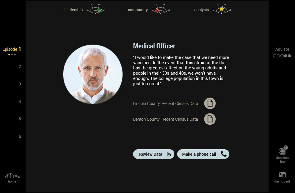
We came back to the drawing board with a new concept: deliver content and direct the learner’s attention only when it is timely. The rest of the information (textbooks, articles, epidata for the pandemic scenario, character profiles, community facility status, etc.) was available at all times, but it was located in a menu they could access when they wanted it, or when the simulation guided them to it when it became directly applicable.
This completely changed the simulation in a variety of ways.
First, we found new, more engaging methodologies to grab the learner’s attention. For example, when the learner needed to be informed that public opinion of the relief efforts was declining, it was much more interesting to read a critical newspaper article about the local hospital’s triage center rather than a small popup saying, “Public opinion of the relief efforts has decreased by 15% in the last week.”
Second, the interface became more streamlined. This frame of mind informed a clean, sharp art style that directed the learner’s attention to the center of the screen where only one task would occur at a time, and supporting information could be found along the edges.
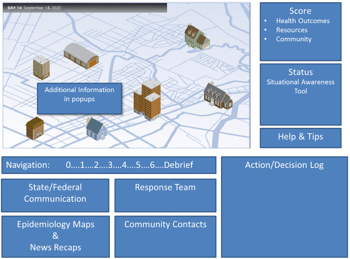
Third, we broke the simulation into six chunks the learner could complete in 10-15 minutes. Each chunk represented a specific day during the pandemic scenario along a two-month timeline.
Lastly, we moved assignments out of the context of the simulation. The learner was required to complete one assignment after each chunk of the simulation before proceeding to the next. This made it feel as though the learner was “training” for each new piece of the simulation. The removal of clutter also made the simulation feel more vibrant, fast paced and emotionally engaging.
(A screenshot from the final design of the healthcare simulation.)
Lessons Learned
The simulation was a well-executed design for us and our client. After having several months to process the experience, there are a few principles I apply to similar projects with high complexity and dense content:
- Make the learning solution feel like a cohesive series of microlearning experiences, rather than one long one, even if the learner will be sitting at a computer for an extended period of time.
- Find new ways to get an emotional response from the learner, even if the piece of content you need to deliver is simply a small piece of contextual information.
- Focus the learner’s attention on as few moving parts as possible without sacrificing the robustness of the learning experience.
- Identify the content that simply cannot fit inside of the microlearning paradigm, and shift it outside of the context of the main learning solution if possible.
It can feel intimidating to design microlearning pieces from longform content. But doing so will help learners understand your information better by reducing chaos and cognitive stress from information overload.